One of the most challenging things in producing products for our customers is to deliver products with their correct colors. I’ve been working in large format printing for most of my career. When talking about color matching, which is what you’re doing with Pantone (PMS) colors, it’s important to understand a few key points. CMYK refers to printing and RGB/HEX refers to non-printed items such as computer monitors.
When you see something on your computer monitor, your perception of this color can be skewed/off because your monitor colors may not be properly calibrated. Unless you’re trained in monitor calibration or you’ve paid to have yours done, you cannot use your monitor to color match or identify if something is the wrong color from a photo. This is important when your customer shares a photo of a color with you.
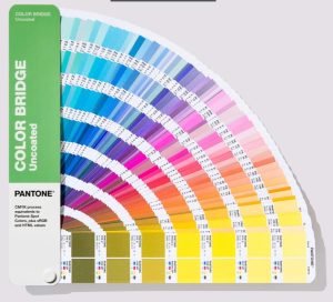
Pantone is a company that produces multiple books filled with more than 2,000 colors (2,390 solid colors as of today). These are actual pigments that have been mixed into paint swatches and individually laid into the book. Each one of these colors has to be laid, one by one, into the book. This is why the books are so costly to purchase. You can print small format graphics (business cards, catalogs, paper products) and use the actual “spot color” ink to get your graphics exactly that color. However, most printers, especially large format printers, convert those spot color values into a CMYK mix. This is called “process color”. This means that even with the best printers, you may not get exactly the same color as you see in the Pantone book, but it will be very close. Many things impact this color including the white values of the substrate (material), and what the material composed of. Certain materials cannot accept very bright or neon-type colors.
The ONLY way to ensure a color will be produced to the color hue you expect is to build a PMS color into your file. This is easily done with any professional design software like Adobe Illustrator or Photoshop. Last year, Adobe started to charge for access to the Pantone libraries. It’s an add-on subscription now. It’s part of doing business and all good designers will already have this.
If you send in a file that is built with CMYK as your color selection, and not a Pantone, it’s a literal crap-shoot what color you will get back. Why is this? Just like your computer monitors, each printer across the world is calibrated (or not calibrated) to set values. Usually these are calibrated to the Pantone catalogs. These printers should also be measured daily and recalibrated when they fall out of a set variance of their standards. This means, if I send a CMYK color to 7 different printers across the United States, I can guarantee I will get 7 unique colors back to me. Some of those will be close, others will be WAY off. If I send this same file, but built with PMS color callouts, to printers that calibrate their machines to Pantones, they should all return to me with the same color values (within a very small window of differences).
Most printers charge for this “color matching” service, some do not. It’s best to ask your supplier about their rules around this service. The best thing you can do to protect yourself and your customers is to order a “Hard Copy Proof” from your supplier. This is a small physical copy of your order that has the actual colors on it. This allows you to get an approval from your customer before going into production.